

About
I am a PhD Candidate at GCCIS, Rochester Institute of Technology (RIT) and work at Sappi-RIT Digital Innovation Lab. I am advised by Konstantinos Papangelis who is also a lab director at Niantic x Research Lab and Vassilis-Javed Khan who is UX Lead at Sappi Belgium.
I work in human AI interaction, with research on interactive AI, human AI reliance, and practical design challenges when deploying AI systems.
I have masters and bachelors in software engineering. I am experienced in software development, data science, and visual analytics.
I am from beautiful Mirpur Kashmir.
You might find interesting to read some of my publications, or reach out to me by LinkedIn or email.
Selected Recent Publications
- [C'26] Muhammad Raees, Vassilis-Javed Khan, Ioanna Lykourentzou, and Konstantinos Papangelis, 2026. "Do People Appropriately Rely on AI-Advice? An Analytical Review of HCI Research on Human-AI Decision-Making". CHI 2026. (24% acceptance rate)
- [C'25c] Yugo Iwamoto, Muhammad Raees, Jamison Heard, and Garreth Tigwell, 2025. "Exploring Generative AI to Support Disability Service Professionals in Writing Image Descriptions for HCI Science Figures". ASSETS 2025.
- [C'25b] Muhammad Raees, Vassilis-Javed Khan, and Konstantinos Papangelis, 2025. "Exploring Persuasive Engagement to Reduce Over-Reliance on AI-Assistance in a Customer Classification Case". UMAP 2025. (24% acceptance rate)
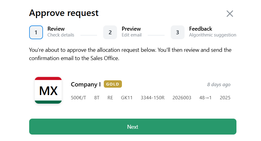
- [C'25a] Muhammad Raees, Vassilis-Javed Khan, and Konstantinos Papangelis, 2025. "UX Challenges in Implementing an Interactive B2B Customer Segmentation Tool". CHI 2025. (30% acceptance rate)
- [J'24] Muhammad Raees, Inge Meijerink, Ioanna Lykourentzou, Vassilis-Javed Khan, and Konstantinos Papangelis, 2024. "From explainable to interactive AI: A literature review on current trends in human-AI interaction". In International Journal of Human-Computer Studies. [Pre-print]
See my Google Scholar for full publication list.
News
| Jan 2026 | | 3 short papers and a DC paper accepted at ACM Conference on Human Factors in Computing Systems (CHI'26) |
| Jan 2026 | | I will be serving Area Chair at CHI 2026 for the Poster Track. |
| Jan 2026 | | Paper accepted at ACM Conference on Human Factors in Computing Systems (CHI'26) |
| Dec 2025 | | Paper accepted at HCI International 2026 |
| Dec 2025 | | I defended my PhD Proposal. I am a PhD candidate now. |
| Aug 2025 | | Short Paper accepted at ACM Conference on Computers and Accessibility (ASSETS'25) |
| Apr 2025 | | Paper (and 2 workshop papers) accepted at ACM Conference on User Modeling, Adaptation and Personalization (UMAP'25) |
| Dec 2024 | | Case Study Paper accepted at ACM Conference on Human Factors in Computing Systems (CHI'25) |
| May 2024 | | Paper accepted at International Journal of Human-Computer Studies |
Blog
I sometimes write on technical stuff, visit my Medium profile to read more!
Exploratory Data Analysis
Unraveling the Story Within Your Dataset — Understand, clean, and prepare a dataset for modeling.
Multiple Y-Axis Graphs with Plotly
When a single y-axis is npt sufficient to represent data adequately, Multiple Y-axis graphs come to the rescue
Visualize Part of a Whole
A waffle chart is a engaging tool in data-viz, offering a unique perspective on proportions
Visual Analytics Recipe
Designing effective visualizations that accurately convey information can be a complex task